A Focus on Nikon at Profusion 2016, Created by Best Displays & Graphics
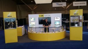 November 29, 2016 — When you combine Nikon, one of the world’s largest dealers in photographic equipment, with ProFusion Expo, one of Canada’s largest photographic trade shows, what you get is a massive challenge!
Luckily, we love massive challenges at Best Displays & Graphics.
We just wrapped up work on a large-scale multipurpose booth for Nikon at ProFusion 2016 in Toronto, and we couldn’t be happier with the results. Neither could Nikon. In terms of meeting the needs of the client while producing a truly striking booth design, we think this could be one of our best pieces of work yet.
Let’s take a look…
The Needs of Nikon
 This wasn’t the first-time Best Displays & Graphics had worked with Nikon. Previously, their local representatives had purchased some standalone pieces from us, like portable fabric tents for small shows. Nikon had never asked us to create a full-scale booth, nor for such a prominent and important industry show.
However, based on that past relationship, they gave us an opportunity to pitch our vision – and they liked it. Plus, as often happens with our satisfied clients, our ability to handle all aspects of booth creation from initial design to shipping\logistics, created a major cost benefit for Nikon that gave us an edge.
The challenge here was largely based on the extensive checklist of features that Nikon had in mind for the booth. Nikon knew what they wanted, and it wasn’t going to be easy.
Their ProFusion 2016 trade show display needed to be:
- Eye-catching and distinctive. ProFusion is a show for photographers, after all, which meant the booth had to be photogenic.
- Easily portable. This wasn’t going to be a single-use booth. The booth had to be structured in such a way it would be relatively easy to break down, pack, store, and transport to more shows in the months to come.
- Modular. As one of the biggest brands in photography, Nikon attends many shows of varying sizes. The booth needed to be able to fit into a wide variety of spaces, and with or without various components as needs dictated.
- Old and new elements combined. Nikon had used certain elements – particularly a half-circle sales counter – in the past, and wanted to retain those elements for consistency.
- 360-Degree Usage. As you can see from the pictures, this was a freestanding display with no true back wall. It could have sides, but had to be attractive from all angles of approach.
As the old saying goes, necessity is the mother of invention. Our designers put their heads together and found a design that met every need.
Putting it Together: The Nikon Design
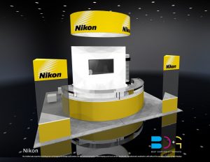
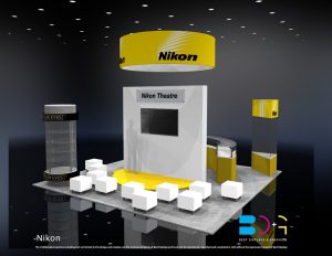 In a very literal way, the centerpiece of the Nikon booth was its two-sided circular display in the middle of the booth. On one side, there was a sales counter with a variety of products on display and room for two sales people. On the other side, a small stage with video display and scattered seating, for in-depth talks.
In fact, we ended up having to put two very large video systems back-to-back in a relatively thin unsupported dividing wall, which was an engineering challenge by itself!
We then added several standalone display cases which would go on the corners of the display, showing off more of their products. From the “front,” these created the effect of funneling traffic flow towards the centerpiece display. On the back\stage side, the semi-random distribution of seats invited people to sit freely.
To add interest, we thought about geometries. We utilized a variety of traditional solid shapes to keep the photogenic factor high, and particularly liked the highly acute triangles of those display cases. The combination of circles, ovals, triangles, squares, and rectangles made it a booth that was truly interesting to look at, but without being overwhelming or unfamiliar. The yellow-and-white color scheme was simply taken from Nikon’s corporate colors.
Finally, we benefited from our use of modular components in an unexpected way. Once we had the initial design built on the floor, it was decided that some tweaks were needed: more storage space, and thicker panels for product security. These changes were simple to implement, with minimal increase to built cost.
Another Success for Best Displays & Graphics
Overall, Nikon was thrilled, and their appearance at the show was a huge success. We even helped them transport the pieces straight to Quebec City, and then to Laval for more shows.
Best Displays & Graphics can help you create a perfect trade show display as well! Contact us today to discuss your vision, and we’ll make it a reality.

